Sketches From Childhood
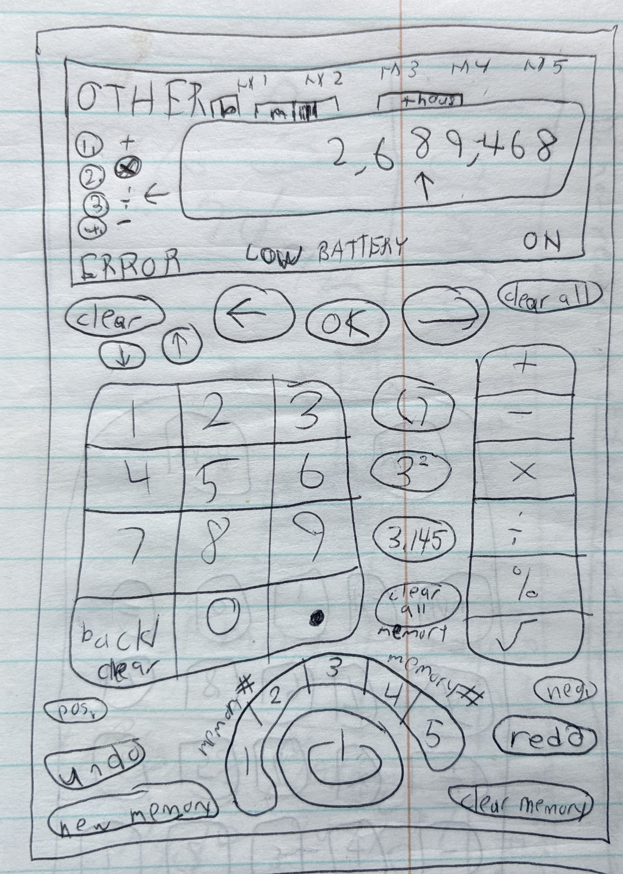
A more beginner-friendly calculator concept. The left/right arrows let users move the cursor to edit a previous digit, and the memory buttons are labeled more clearly than the usual 'M+', 'MR' abbreviations.

Kid me loved my Nikon Coolpix L15. I do not love what kid me attempted here: displaying every control indicator onscreen at once. It was a misguided attempt at unsimplifying. Still, I appreciate my engagement with that sleek silver marvel of 2007 tech.

A concept for a cell phone (not a smartphone) series in multiple sizes, with the touchscreen model as the largest and most premium. This is probably my favorite sketch here, because it shows my early thinking about how UI can adapt to different sizes and input methods.

Watching Yankees games with my dad, I paid more attention to the score banner designs than to Mariano Rivera's strikeouts. Naturally, I had to sketch my own designs.

Dabbling in information architecture for a word processor. It may be missing a few features, but at least you can actually find what you're looking for. (Take notes, Microsoft Word.)

More of the word processor. At the time, I'll bet I thought I was very clever just for moving the right-align button further to the right. Right-aligned Comic Sans – perfect!

Studying and redrawing logos of car brands. I was never the best at illustrating, as is evident here – but I do love studying logos and what makes them effective (or ineffective).

When visiting the NY auto show, I would take notes of my first impressions of new cars' interior designs. If my 10-year-old judgment was correct, Dodge Grand Caravan buyers were in for a rough time here.

This is the onscreen UI for a racing video game called ExciteBots. Here I'm trying to cram most of it into one top toolbar, and it's... not working very well. But that slim turbo meter in the bottom right? Not bad.

Another video game here, with my idea of having so many game modes on the main menu that they would best be presented as a categorized grid of icons. Again, certainly not my best work, but I admire the ambition.

A redesign concept for the front of my family's old CRT television. Visually, the UI is actually quite an improvement over the hideously large and pixelated style that the TV used – though mine might've been too small to practically implement on such a low-res display.

A redesign of the CRT TV's accompanying remote. This crude jumble of buttons is at least less overstuffed than the actual remotes of the time were, with their tiny, extraneous, and garishly colored arrays of buttons overwhelming the user.