
Restructuring the iPhone Camera App to Make it Simpler and Faster
➜
➜
Project Summary
In a camera app, speed and intuitiveness are critical to ensure users can capture what they want, right when they want to. This redesign of the iPhone camera app’s structure makes controls easier to locate, enables faster mode switching, and is more comfortable to use one-handed.
Team:
Solo, self-initiated
Role:
UX design
Timeline:
2022-2023
Tools:
Figma, Sketch, paper & pen
Contents
Click to navigate
➜
+ Prototype Video
Wireframing
Visual Design
Prototyping
User Testing & Iteration
➜
Background
Over the past 15 years, the design and functionality of the iPhone camera app have evolved dramatically, in parallel with the rapid increases in capability of the camera hardware. Whereas the original app was essentially just a shutter button, it now offers access to a plethora of photo and video modes, many settings within each mode, focus and exposure adjustments, and lenses of differing focal lengths. Unfortunately, it is also more complicated to use now, which is definitely not what one wants when trying to capture something fleeting.
I’ve made attempts at designing my own version of the camera app since I was in high school. They were more visual design exercises than full UX projects, but they got me thinking about different ways to organize the controls.
Research
Film Camera
When Steve Jobs introduced the iPhone 4, he compared its design to that of a “beautiful, old Leica camera.” Luckily, I was able to get my hands on exactly that. My late grandfather had passed along his personal camera, which is likely from the 1940s.
Although it feels heavy compared to modern devices, everything else about the design of this camera has aged wonderfully. The svelte form factor, crisply engraved type, and sharp tactility of every knob – it all exudes top-notch quality and care. If this is what could be achieved nearly a century ago, we should expect a similarly high standard of design for our cameras today. The touchscreens we have now, though inherently less tactile, offer unprecedented flexibility for creating an intuitive photography experience.
iPhone Camera App Evolution
I went back and examined major design iterations of the camera app. Below is a snapshot of each, followed by my analysis of its strengths and weaknesses.

2012 🫤
The photo<>video toggle, as well as the flash and flip camera buttons, all worked well. But the “Options” menu to reveal Grid and HDR looked clunky, and putting Panorama in there didn’t make much sense, as it launched a separate mode.
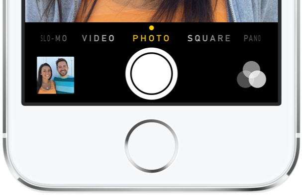
2015 🙂
As more new modes were added, Apple wisely switched to a swipe-based carousel interface to move between them. The top toolbar offered quick access to frequently adjusted controls, and more infrequent actions were moved to the Settings app.

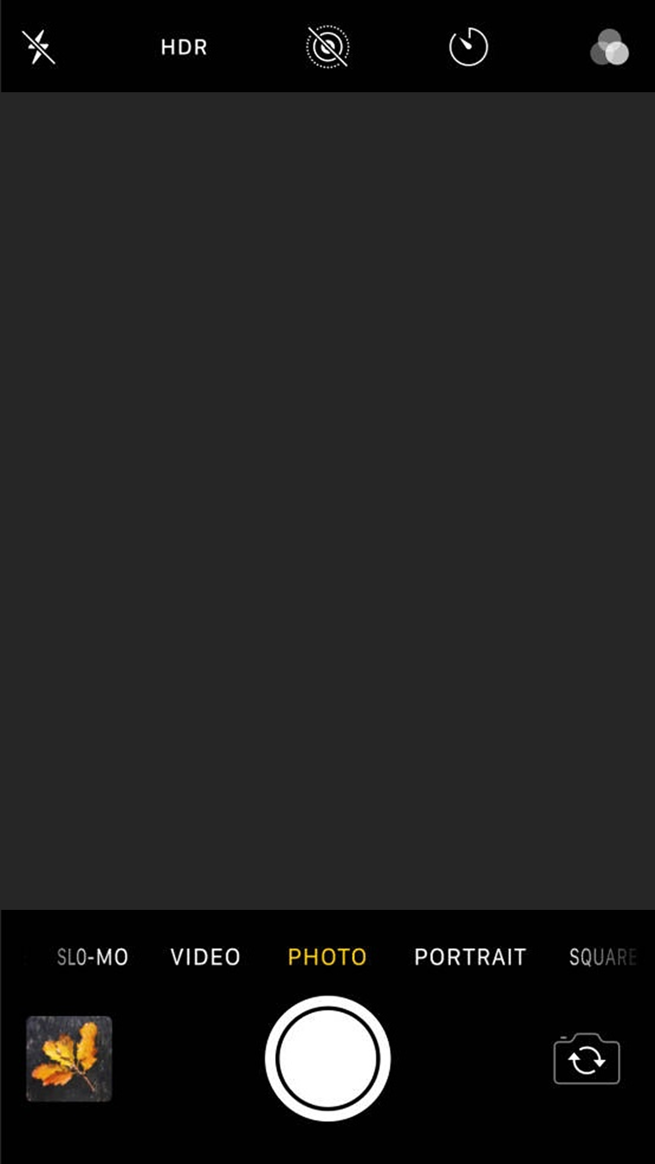
2019 😔
With the top toolbar no longer able to contain all the controls and features, a second, hidden toolbar was introduced (which itself requires a horizontal scroll to access even more). Despite this, tap targets on the top toolbar got smaller.
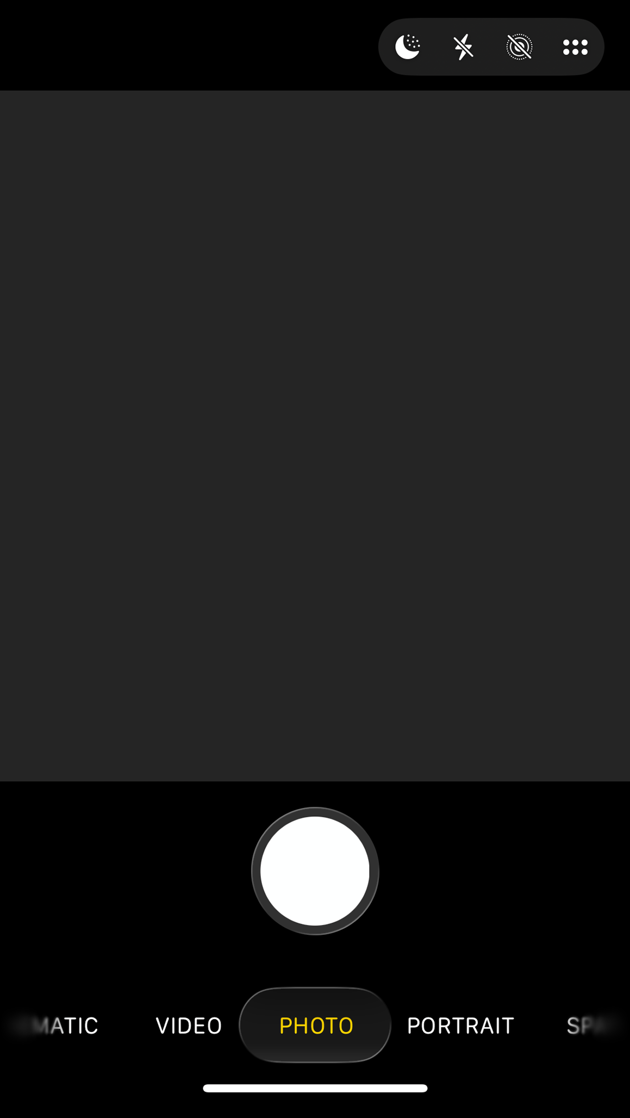
2025 🫤
Since I completed my project here, Apple made some more refinements, the most notable of which was making the modes carousel directly slide-able for faster switching. It’s a neat idea, but its placement so close to the bottom of the phone is dangerously near the home bar area for sliding between apps.
Mimicking physical elements of cameras digitally
Interestingly, despite the decline of skeuomorphic design post-2012, Apple has continued to experiment with imitating classic camera elements digitally. For example:
An earlier version of the carousel mode switcher further emphasized its reference to classic cameras with a font (and a little stationary dot) similar to that of a Leica.
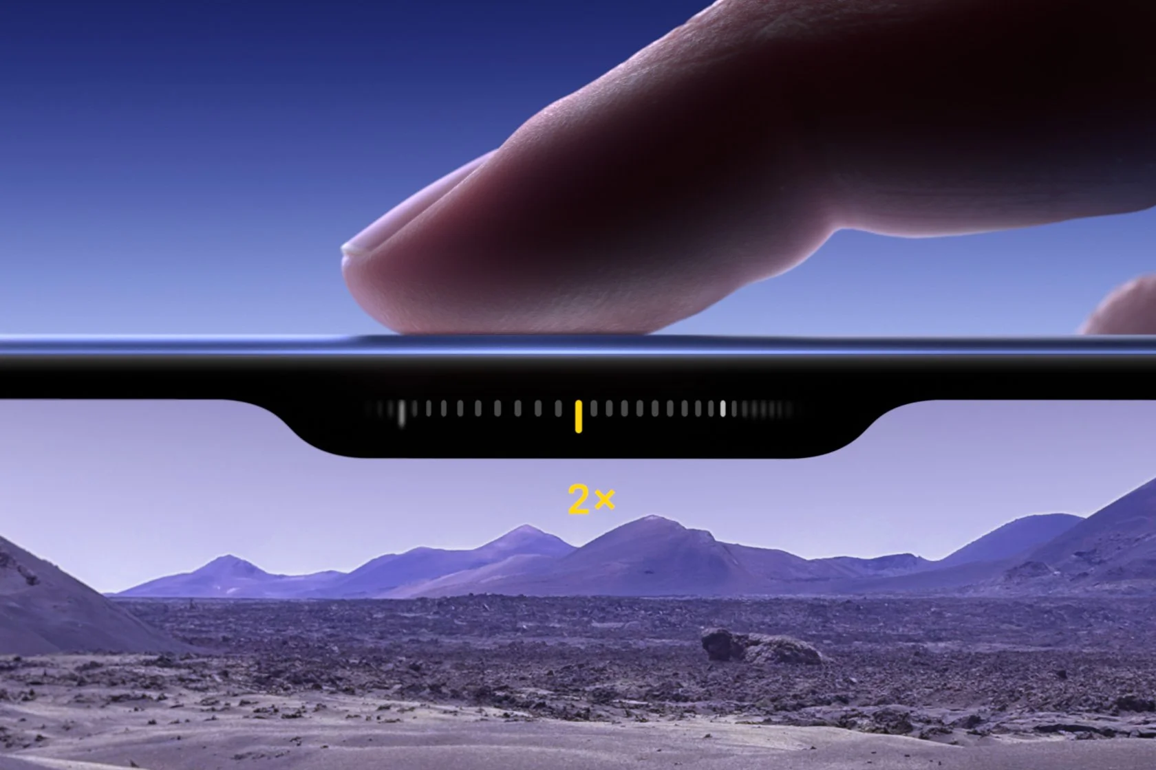
“Camera Control” on new iPhone models allows for adjusting settings by swiping along the edge of the device – a gesture somewhat similar to turning an actual settings knob on a camera.
The new camera app icon in iOS 26 swaps the previous simple glyph for a detailed rendering of a lens.

Why continue referencing the vocabulary of standalone cameras now that they’re only really necessary for professional photographers? Perhaps it’s because the thin slab of glass that is an iPhone is inferior ergonomically to the large, contoured form of a full-size camera. To compensate, some elements can at least evoke the spirit of shooting with a dedicated camera – while remaining congruent with iOS design conventions.
Planning
I identified the issues/drawbacks of Apple’s current camera app that I wanted to address in my redesign.


Design
Wireframing
I began by simply sketching all the options as they exist in Apple’s app, and then trying to group them in logical ways to reduce the number of buttons. My goal was to reduce the maximum number of settings buttons that could be presented in any mode from 8 to 6, so that all buttons could all fit on one toolbar with large tap targets and no scrolling.

I decided to combine:
Flash and night mode – Both are options for improving photos in low-light conditions, so it makes sense to group them together. (In addition, both cannot be set to on simultaneously. This makes it even more logical to combine them into a single pop-up, so the user can easily see how changing one setting may affect the other.)
Filters and photographic styles – Apple’s '“photographic styles” are essentially better, more customizable filters that render many of the old filters redundant. Combining these into a single button and interface would simplify and reduce confusion.
Next, I replaced the swipe-based “wheel” UI for switching between modes with a simple pop-up list. This not only allows for faster mode switching, but also frees up vertical space to make the full toolbar always visible while capturing – eliminating the convoluted double-toolbar structure Apple uses.

I made the buttons for Standard Photo and Standard Video modes larger to make them super easy to access, and to subtly highlight the fact that photo and video sub-modes are grouped.
Visual Design
For the visual design, I built off the existing clean, monochromatic style of Apple’s app. I kept the toolbar icons the same, but created all-new icons for the camera modes.


Prototyping
To perform some user testing on my mode switching redesign, I decided to prototype it within Figma. I created component buttons and mode menu screens for each mode, and added the appropriate interactions to the component buttons. (I also prototyped the flash toggle, which was more challenging – I ended up using component variants with both state changes and local variable changes applied on interactions.)


User Testing & Iteration
Starting in Standard Video mode, my first task for users was to simply switch to Standard Photo mode. Multiple users did not readily identify the video icon as an indicator of the current mode, and thus did not recognize it as the mode switching button.
I rectified this by adding an arrow next to the icon, which clearly indicates that it will open a menu. Subsequent users then had absolutely no trouble, quickly identifying the button and completing the task.


Conclusion
My prototype successfully resolves the issues I identified with Apple’s camera app. All controls fit near the bottom for easy one-handed access, and they can be accessed with simple taps instead of a series of swipes and scrolls.
One potential issue in implementing this design would be inflexibility in adding new features and modes over time. For instance, where would a new toggle on the bottom toolbar go? Perhaps it could merge with an existing one, like what I did with flash and night mode – though a similarly logical grouping wouldn’t necessarily present itself. I admittedly don’t have a great answer here, though I don’t believe Apple’s method of just adding more buttons is sufficient either.
Regardless, it will be interesting to see how the interface continues to adapt to the growing complexity and power of the camera hardware – especially as smartphone cameras impact our lives in ever more pervasive and important ways.
Interactive Prototype
Working functionality includes switching between all modes, as well as changing the flash setting in Standard Photo mode. Click around below, or open in Figma.
Prototype Demonstration Video
Get a glimpse into how this prototype might function in real-world use with a fun short video I made.